Exploring Financial Tick Data with Jupyter Notebook and Pandas
Visualizing financial tick data by ingesting data into QuestDB and analyzing trends with Pandas, Jupyter Notebook, matplotlib, and seaborn. records on the fly.



Pandas is one of the most popular open-source Python libraries used for data
analysis and manipulation. It provides standard data structures (e.g.,
Dataframe, Series) and utility functions that make it easier to sanitize,
transform, and analyze various data sets. Pandas also has great support for
NumPy’s datetime64 and timedelta64 types as well as integrations with other
popular libraries such as scikits.timeseries, which makes for a great choice
to process and analyze time series data.
The extensive capabilities of Pandas for time-series data make it a great complementary piece for QuestDB for a data analytics tech stack. Pandas provides the data structure for working with various time-series data types and analytic libraries in memory, while QuestDB provides fast and reliable storage options. When used in combinations, users can easily manipulate data either in Pandas or QuestDB for insights.
In this article, we will explore crypto prices with Pandas and QuestDB, keeping in mind the various scenarios for integration. We will walk through several options to ingest data into a Python workspace or QuestDB, analyze the dataset using Pandas or SQL, and finally visualize the results.
Prerequisites
Importing financial tick data
Depending on the size and the format of the data, we have a few options to import tick data for analysis. The example crypto dataset from Kaggle is relatively small and in a nice CSV format that is well-supported by QuestDB. In this case, we can easily use the console UI to upload the CSV files.
Download and run the latest version of QuestDB:
$ docker run -p 9000:9000 \-p 9009:9009 \-p 8812:8812 \-p 9003:9003 \questdb/questdb
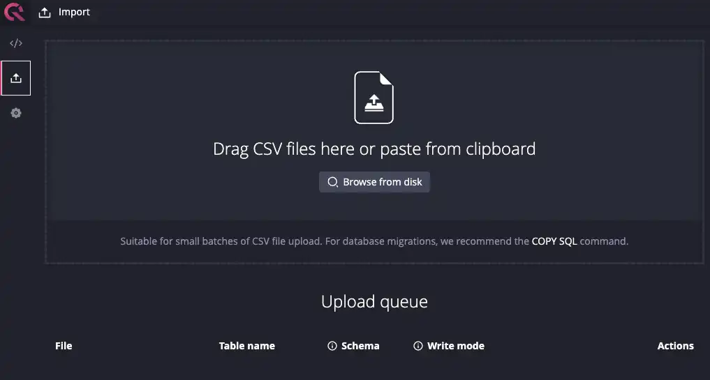
Navigate to http://localhost:9000, click on the
“Upload” icon on the left-hand panel and import the
csv files of interest.
This example will use the Bitcoin dataset, but any of the coins from the dataset will also work.
If your data is in Parquet rather than CSV, QuestDB reads it natively and there
are two ways in. From SQL,
read_parquet() reads the file
directly, so an INSERT INTO ... SELECT loads it into an existing table, and
CREATE TABLE AS builds a new one from the file's own schema. Through Python,
load the file with pandas.read_parquet() and hand the frame to the official
Python client, which ingests it column by
column: see Pandas integration.
For a dataset to try this on, you can build your own historical coin pricing
information with the
Deephaven CryptoWatch API
example.
Note that we are first loading the data into QuestDB prior to doing any analysis. We could also load it into Pandas and do some preliminary exploration and only import a subset of the data to QuestDB. Either option can work, but for large datasets, it’s often a good idea to load data first into QuestDB and downsample before analyzing via Pandas. This is because Pandas loads all the data in memory, making it inherently limited by the available memory of the machine it is running on.
Ultimately the order of operation to load data into Pandas or QuestDB first depends on the structure and source of the data, as well as the makeup of your data organization. For example, if a different team is responsible for data ingestion either via Kafka or daily CSV upload, it may make sense to load it into QuestDB first. On the other hand, if your data science team is closer to the source of the data, you could do some data cleaning first in Pandas before shipping sanitized datasets to downstream teams for visualization.
For simplicity's sake, we will use the Kaggle dataset in the rest of this tutorial.
Setting up Jupyter Notebook
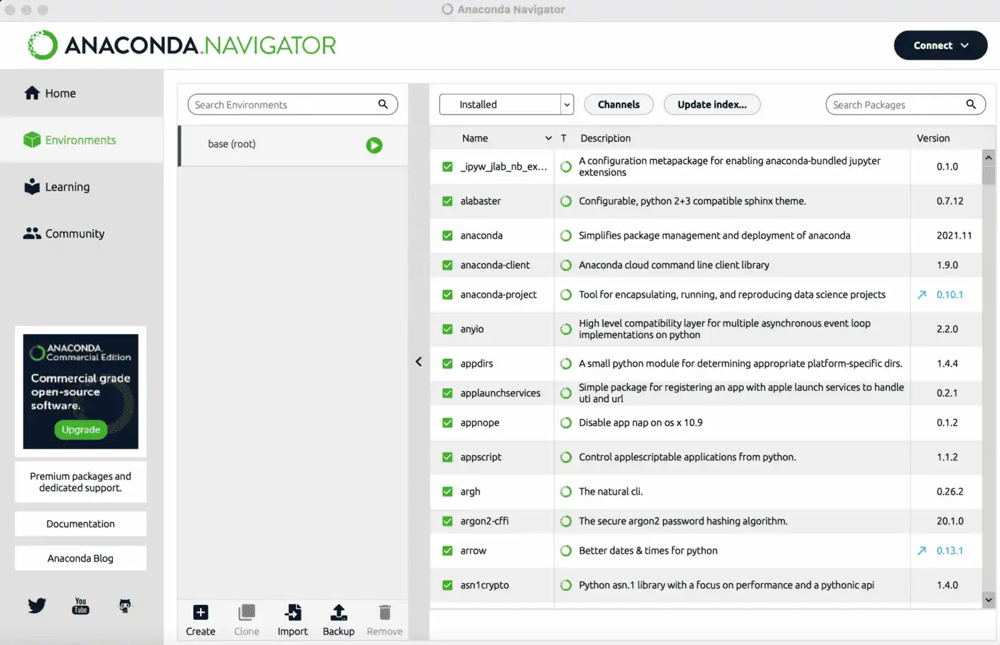
Install Jupyter Notebook via pip or with your favorite Python environment management tool such as conda, mamba, and pipenv. Alternatively, you can also download Anaconda Navigator for your OS.
$ pip install notebook
Now install the packages we will use to explore the dataset:
$ pip install –upgrade pip # upgrade pip to at least 20.3$ pip install numpy pandas==1.5.3 matplotlib seaborn psycopg
If you used Anaconda Navigator, go under Environments > Search Packages to install:
Now we’re ready to launch the notebook and start exploring the data:
$ jupyter notebook
Connecting to QuestDB
The psycopg route below still works. Since QuestDB 10.0 there is a more
direct one: the first-party
Python client streams query results
over QWP and materializes them with to_pandas(), so there is no PostgreSQL
driver and no read_sql in between. See
Pandas integration.
However you fill the df object, everything after this section applies
unchanged. The native client is just the most efficient way to fill it.
First, we need to use the psycopg library to connect to QuestDB and import the
data:
import pandas as pdimport numpy as npimport psycopgcon = psycopg.connect("dbname='qdb' user='admin' host='127.0.0.1' port='8812' password='quest'")df = pd.read_sql('select * from coin_Bitcoin.csv', con)
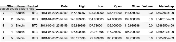
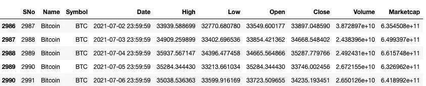
Now we can run some quick queries to make sure our import was successful. The
head and tail functions are useful in this case for a quick sanity check:
df.head()
df.tails()
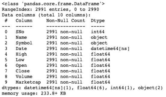
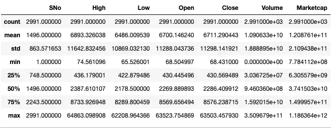
Alternatively, we can use the info and describe commands to get a sense of
the data types and distribution:
df.info()
df.describe()
For good measure, we can also check for null or na values to make sure we’re
working with a clean dataset.
df.isnull().any()df.isna().any()
These queries should return False for all the columns. If you have missing
values in your dataset, you can use the dropna function to remove that row or
column.
In this example, we are simply loading the entire dataset via a select * query. But in general, if your dataset is big, it’ll be more performant to select a smaller subset by running SQL queries on QuestDB and only exporting the final results to Pandas. This will circumvent the memory limitations of Pandas as noted before and will also speed up the export process.
Also, this approach may also make more sense if your team is more comfortable
with running SQL queries to narrow down the data first. Standard SQL queries to
filter/join/order columns can be combined with time series-related helper
functions such as aggregate functions (e.g., avg, first/last, ksum, etc)
to manipulate and transform the data of interest. Then a smaller subset of this
query can be imported into Python for further analysis or visualization with
Python libraries.
Exploring the data
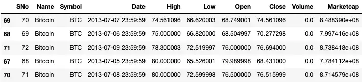
Now that we have our dataset in Jupyter, we can run answer some simple
questions. For example, we can find the five lowest prices of Bitcoin by running
the nsmallest function on the column we’re interested in (e.g. High, Low,
Open, Close). Similarly, we can use the nlargest function for the opposite:
df.nsmallest(5, 'High')# df.nlargest(10, 'Low')
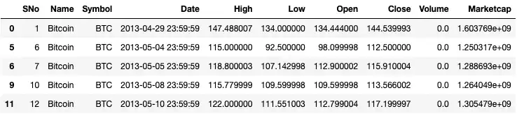
We can also find days when the open price was lower than the closing price by
using the query function:
df.query('Open < Close').head()
To get a better sense of the trends, we can resample the dataset. For example,
we can get the mean prices by week by using the resample function on the
Date column:
df_weekly = df.resample("W", on="Date").mean()df_weekly.head()
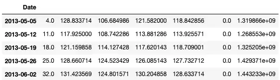
Now our data is aggregated by weeks. Similarly, we can get a rolling average
over a set window via the rolling function:
df_rolling_mean = df.rolling(7).mean()df_rolling_mean.tail()
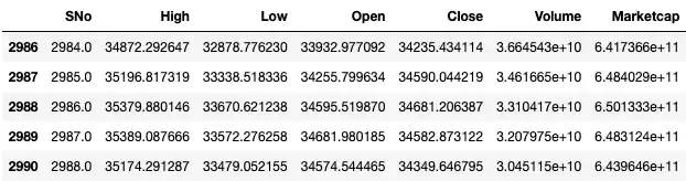
Visualizing the data
To visualize our crypto dataset, we’ll use the seaborn library built on top of matplotlib. First import both libraries and let’s plot a simple graph of Bitcoin's opening price over time:
import matplotlib.pyplot as pltimport seaborn as snssns.set(rc={'figure.figsize':(11, 4)})df = df.set_index('Date')df['Open'].plot(linewidth=0.5);
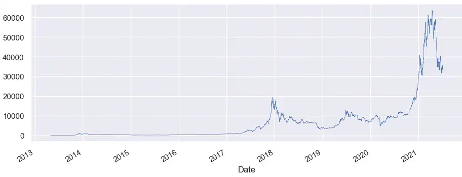
Note that seaborn chose some sane defaults for the x-axis. We can also specify
our own labels as well as legends like the plot below comparing the High, Low,
and Opening prices of Bitcoin over time:
cols_plot = ['High', 'Low', 'Open']axes = df[cols_plot].plot(marker='.', alpha=0.5, linestyle='None', figsize=(11, 9), subplots=True)for ax in axes:ax.set_ylabel('Price ($)')
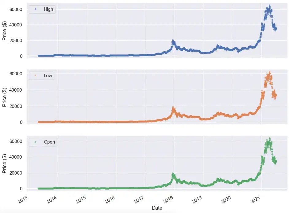
From a quick glance, it is hard to tell the trends of any of these price actions. Let’s dive into a time period when the Bitcoin price starts to become more volatile (i.e. after Jan 2021). We can specify a subset of the dataset using the loc function and apply it to our full dataset, weekly mean resample, and seven-day rolling mean.
After giving each of the datasets a different marker, we can plot all of them on the same graph to see when the opening price was above or below the weekly or moving window average:
fig, ax = plt.subplots()ax.plot(df.loc['2021-01-01 23:59:59':, 'Open'], marker='.', linestyle='-', linewidth=0.5, label='Daily')ax.plot(df_weekly.loc['2021-01-01':, 'Open'], marker='o', markersize=8, linestyle='-', label='Weekly Mean Resample')ax.set_ylabel('Price ($)')ax.legend();
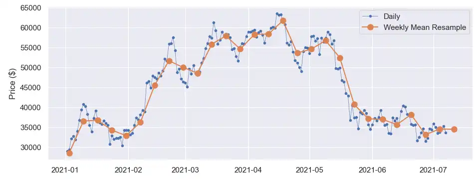
We can zoom in further in the May to July timeframe to capture the volatility.
Alternatively, we can also apply the popular 200-day moving average metric to
analyze price trends. Finally, we can also use the ewm function in Pandas to
calculate an exponentially weighted moving average to gather different momentum
indicators. While past performance is not indicative of future performance,
these momentum indicators can be used to backtest and formulate new trading or
price analysis strategies.
Conclusion
Pandas and QuestDB make for a powerful combination to perform complex data analysis. In this article, we walked through an example of analyzing historical crypto data with Pandas and QuestDB. We also discussed some options for importing and analyzing the data in Pandas or QuestDB based on data size, format, and team structure.
At the end of the day, the most ideal workflow will depend on the size of your data, the expertise of your team, or where responsibilities are divided amongst various teams. The good news is that all of these workflows can be mixed together as your data or team shifts over time.
If you are interested in more financial tick analysis, make sure to check out: