Notebook charts
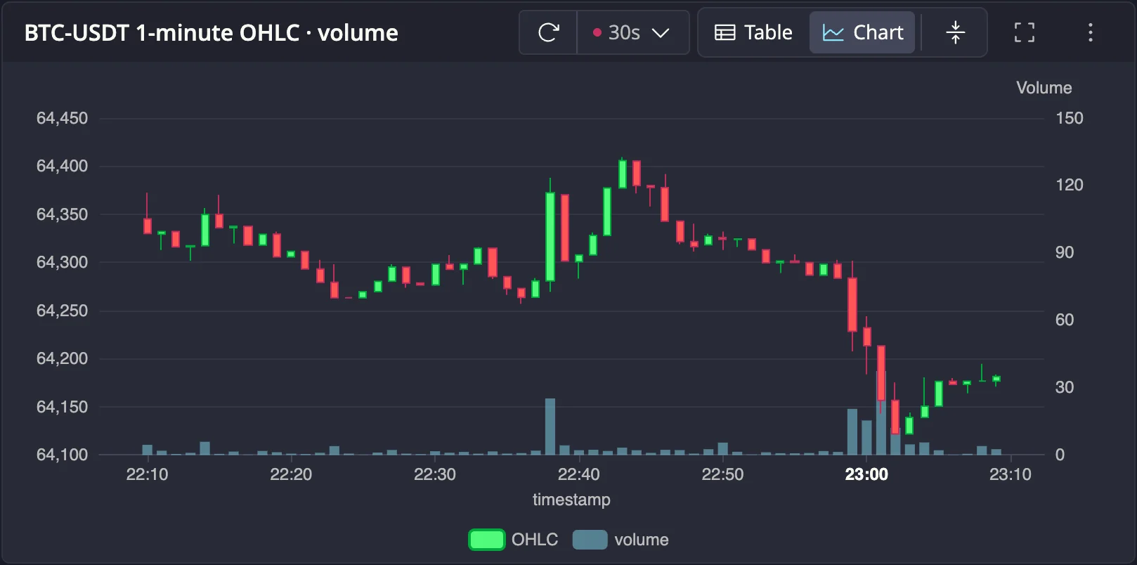
Any query in a notebook cell can render as a chart in place: press Draw and the cell plots the result, picking a sensible chart type from its shape. Charts live inside their cells, refresh on a schedule, and combine several queries on one canvas.
Drawing a chart
Draw runs the cell's query and charts the result. The initial chart type is inferred from the columns the query returns: a timestamp and a number become a line chart; a timestamp, a symbol, and a number become a line per symbol; a category and a number become a bar or pie chart. You can change everything afterwards in Chart settings.
Only SELECT queries can be drawn. A cell containing DDL/DML is refused with
a message telling you to run it with Run instead. Each statement plots up
to the per-statement row cap (see
Storage and limits).
Chart types
Nine chart types are available: Line, Area, Step line, Step area, Bar, Stacked bar, Scatter, Pie, and Candlestick. The type picker only offers types that fit the result's columns.
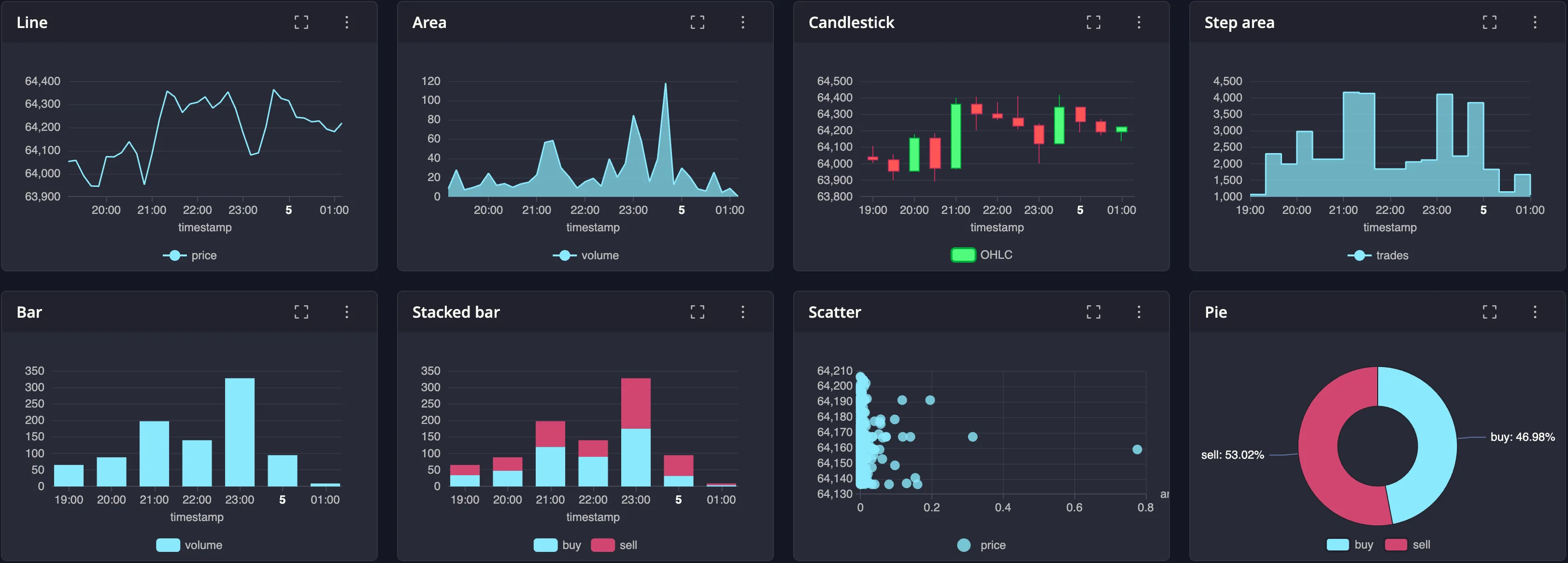
Chart settings
Open the drawer from the cell's ⋮ menu → Chart settings. Nothing is applied until you press Save, and saving never re-runs the query.
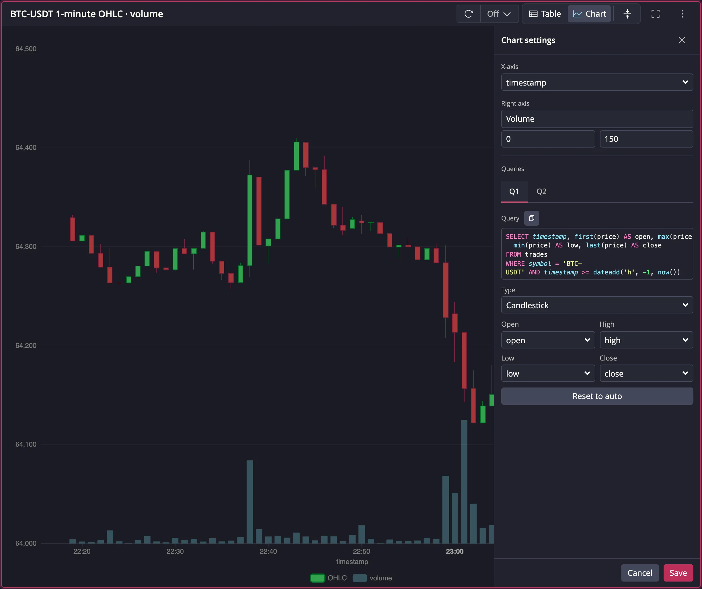
From top to bottom:
- X-axis: the column that drives the x-axis, from the first query's columns.
- Right axis: appears once any query is assigned to the right axis; set its name and optional min/max bounds. For example, capping the volume axis at 150 keeps the bars in the bottom quarter of the chart.
- Queries: with several statements in the cell, a Q1/Q2… tab strip selects which query you are configuring.
Each query's panel then offers: the read-only SQL with a copy button, Include in chart (for queries after the first), Type, the Series columns (or Value for pie, or the OHLC mapping for candlestick), Partition by, Y-axis (Left or Right), and Reset to auto.
Partition by splits one query into a separate series per distinct value of a category column, e.g. one line per symbol.
Combining multiple queries
A cell with several SELECT statements draws them all on one
chart. The first successful statement anchors the x-axis; other queries join
when their x-axis is the same kind: time with time, categories with
categories. A query that cannot combine is left out of the chart and flagged
with a warning on its tab in the drawer.
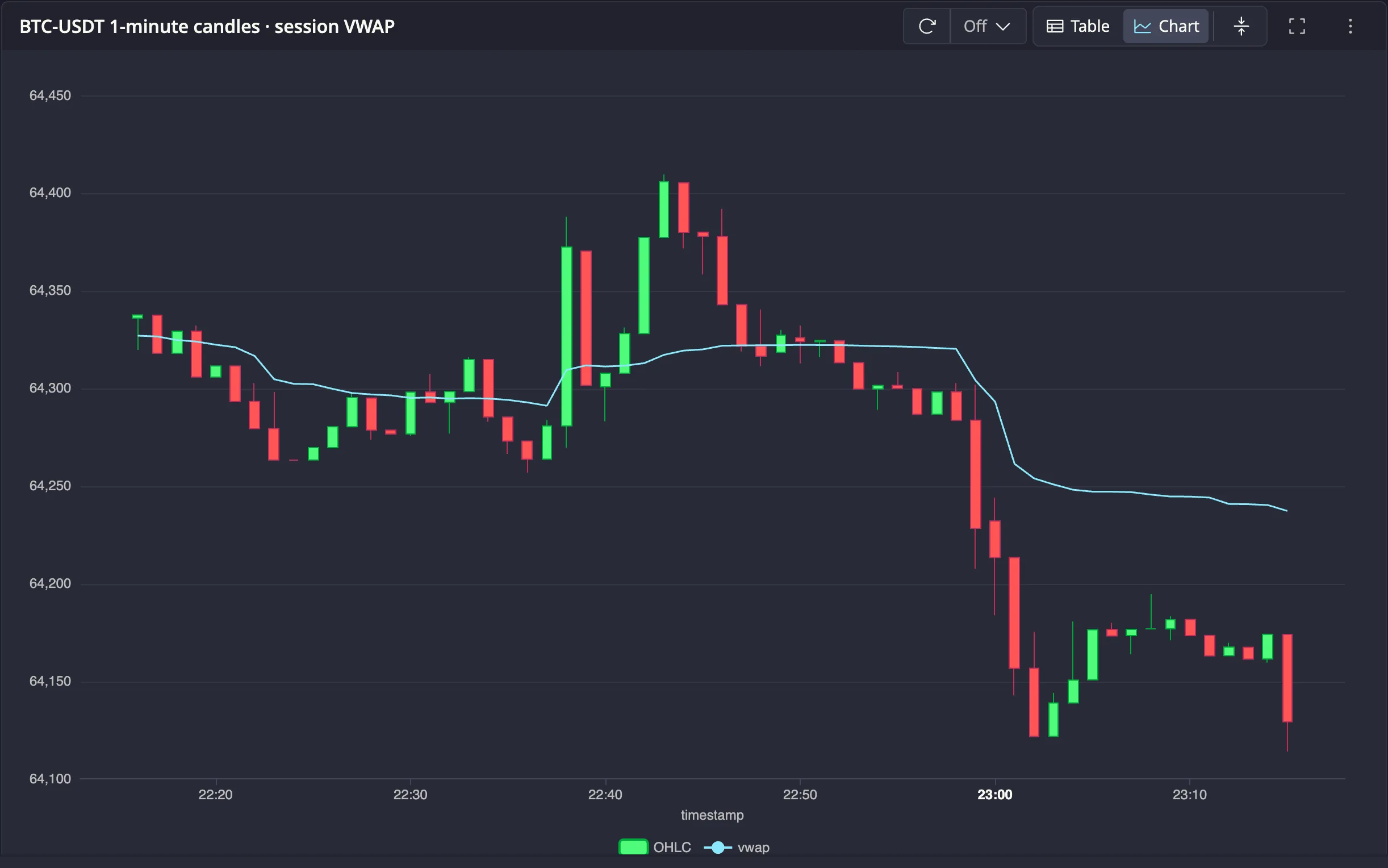
Each query keeps its own chart type on the shared canvas. Below, one statement returns 1-minute OHLC candles and a second computes a running session VWAP; drawn together, the VWAP line overlays the candles:
Reading the chart
The y-axes fit the data instead of forcing zero, and re-fit as new data arrives. A scrolling legend sits below the plot; click a legend entry to hide or show that series. Hovering shows a tooltip with the value of every series at that point.
Zooming
When a result has more points than the chart can show at once, a range slider appears under the plot. Drag it to select a window, or scroll to zoom and drag on the plot to pan. A Reset zoom button appears beside the view toggle while zoomed.
Keeping charts fresh
Refresh now in the cell menu re-runs a chart on demand. Charts can also refresh automatically on a schedule, with a notebook-wide default and per-cell overrides. See Live dashboards for details.
Next steps
- Notebook variables covers parameterizing chart queries with
@namevalues - Live dashboards covers the grid layout and chart auto-refresh