Sparklines for traders: candlesticks and depth charts in SQL
There's a moment in every data exploration session where you stop trying to read the numbers and start trying to see them. You squint at the screen, mentally drawing imaginary lines between the rows, trying to figure out whether the price drifted up or down, whether one symbol is more volatile than another, whether the order book is balanced or lopsided. At some point you give up, copy the data into a notebook, and load matplotlib.
That moment is what sparklines are for.
Edward Tufte coined the term in Beautiful Evidence (2006) for "small, high-resolution graphics embedded in a context of words, numbers, and images." The idea was that a tiny chart placed next to its number is often more informative than either the number alone or a full-sized chart in isolation. Tufte drew his sparklines as actual line graphics in print, but the Unicode block characters at code points U+2581 through U+2588 give us a way to put them in plain text:
▁▂▃▄▅▆▇█
Once that idea reached SQL, a handful of databases grew built-in bar() and
sparkline() functions that return Unicode strings, so you can see the shape
of your data inside the result set itself.
QuestDB now ships these too, landing in the
next release. bar() renders
a single value as a horizontal bar
with sub-character precision via fractional blocks:
█▉▊▋▌▍▎▏
SELECT symbol, round(price, 4) price,bar(price, 0.5, 1.5, 25)FROM fx_tradesWHERE symbol IN ('EURUSD', 'GBPUSD', 'USDCHF', 'USDCAD', 'AUDUSD')LATEST ON timestamp PARTITION BY symbol;
symbol | price | bar--------+--------+------------------------AUDUSD | 0.7128 | █████USDCAD | 1.3708 | █████████████████████USDCHF | 0.7836 | ███████EURUSD | 1.1618 | ████████████████GBPUSD | 1.3417 | ████████████████████
sparkline() is the aggregate version, taking any numeric column and rendering
the trend as a vertical block chart, naturally pairing with SAMPLE BY:
SELECT timestamp, symbol,round(avg(price), 0) av_price,sparkline(price, NULL, NULL, 20)FROM tradesWHERE symbol IN ('BTC-USDT', 'ETH-USDT')AND timestamp IN '$yesterday'SAMPLE BY 1hLIMIT -5;
timestamp | symbol | av_price | sparkline-----------------------------+----------+----------+----------------------2026-04-28T21:00:00.000000Z | ETH-USDT | 2291 | ▆▇▆▅▄▃▃▄▃▃▂▃▃▃▃▁▂▁▃▃2026-04-28T22:00:00.000000Z | BTC-USDT | 76343 | ▅▆▅▆▇▇▆▅▅▄▄▄▄▄▄▃▂▂▁▁2026-04-28T22:00:00.000000Z | ETH-USDT | 2290 | ▅▅▅▆▆▇▆▄▄▄▄▄▃▃▂▂▂▁▁▁
So far, prior art. The interesting question for us was: what would a sparkline look like if it spoke the visual language of the people who actually use QuestDB?
A large share of QuestDB workloads are market data. Traders don't look at
candlesticks because candlesticks are pretty. They look at them because the
open-high-low-close encoding has been the working visual notation for price
action since
Munehisa Homma was trading rice in 18th-century Osaka.
Same goes for depth charts and order books: a balanced book and an imbalanced
book are immediately distinguishable as shapes, and no amount of scrolling
through bid_volume and ask_volume columns gives you that intuition as fast.
A generic vertical block sparkline of the closing price loses everything that
makes the data tradeable.
So we added two more functions, currently under review in questdb/questdb#7039.
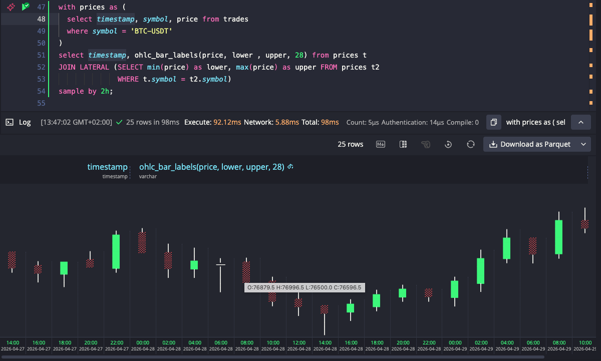
OHLC bars in your terminal
ohlc_bar() renders a horizontal candlestick directly in the result set. The
aggregate variant computes O/H/L/C from raw price ticks and renders in one
step:
SELECT timestamp,ohlc_bar(price, 1.15, 1.19, 40)FROM fx_tradesWHERE symbol = 'EURUSD'AND timestamp IN '$today'SAMPLE BY 30mLIMIT -5;
timestamp | ohlc_bar--------------------------------+--------------------------------------2026-04-29T11:00:00.000000000Z | ⠀⠀⠀⠀⠀⠀⠀⠀⠀─░░░░░░░░░░░░───────────2026-04-29T11:30:00.000000000Z | ⠀⠀⠀⠀⠀⠀⠀⠀──██─────────────────────2026-04-29T12:00:00.000000000Z | ⠀⠀⠀⠀⠀⠀⠀⠀⠀⠀⠀─███████████████───────2026-04-29T12:30:00.000000000Z | ⠀⠀⠀⠀⠀⠀⠀─────░░░░░░░░░░░░░░░░░⠀2026-04-29T13:00:00.000000000Z | ⠀⠀⠀⠀⠀⠀⠀────██─────⠀⠀⠀⠀⠀⠀⠀⠀⠀⠀⠀
The output uses these characters for different candlestick parts:
█ bullish body (close > open)░ bearish body (close < open)─ wick (high/low beyond the body)│ doji (open ≈ close)
All candles in a result set are scaled against the same explicit min/max
bounds, so their horizontal positions are directly comparable across rows.
Bounds can be constants, DECLARE variables, a CROSS JOIN subquery for
single-symbol dynamic bounds, or a LATERAL JOIN for per-symbol bounds in
multi-symbol queries.
The web console picks up on the function being called and colorizes bullish bodies green and bearish bodies red. It also offers a rotate button that turns the result set into a vertical candlestick chart, with timestamps along the bottom, of the kind you'd recognize from any trading platform.
When you already have precomputed OHLC values, the scalar variant takes them
directly: ohlc_bar(open, high, low, close, min, max [, width]). There's also
ohlc_bar_labels(), which appends the precise values after each candle, so you
can read the bar and the numbers on the same row:
O:1.162 H:1.183 L:1.161 C:1.177
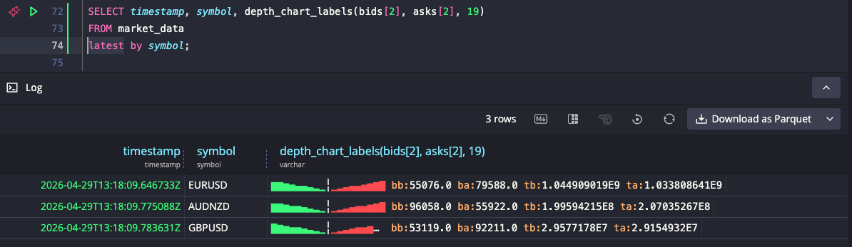
Order book depth, as a shape
depth_chart() is the function we got most excited about. You pass in two
arrays, bid volumes and ask volumes, and it renders the cumulative depth profile
with bids on the left, asks on the right, and a separator marking the spread:
SELECT timestamp, symbol,depth_chart(bids[2], asks[2], 19)FROM market_dataWHERE timestamp IN '$today'AND symbol IN ('EURUSD', 'GBPUSD', 'USDCHF', 'USDCAD', 'USDJPY')LATEST ON timestamp PARTITION BY symbol;
timestamp | symbol | depth_chart-----------------------------+--------+---------------------2026-04-29T13:18:09.646733Z | EURUSD | ▇▇▆▅▄▄▃▂▁╎▁▂▃▄▄▅▆▇█2026-04-29T13:18:09.783631Z | GBPUSD | █▇▆▅▅▄▃▂▁╎▁▂▃▄▅▅▆▇▇2026-04-29T13:18:10.044379Z | USDCHF | ▇▇▆▅▅▄▃▂▁╎▁▂▃▄▅▅▆▇█2026-04-29T13:18:10.106524Z | USDCAD | ▇▇▆▅▅▄▃▂▁╎▁▂▃▄▅▅▆▇█2026-04-29T13:18:10.159159Z | USDJPY | ▁▁▁▁▁▇▇▇▆╎▆▇▇█▁▁▁▁▁
Cumulative depth spans a wide dynamic range, so the function applies log1p()
under the hood to compress it. Without the log scale, only the deepest
levels would be visible and everything near the spread would flatten to the
lowest character. With it, the shape of the book is legible at a glance: a
symmetric profile means a balanced book, one side taller than the other means
liquidity is skewed.
The third argument sets a fixed width of 19, meaning 9 levels per side plus the spread separator. Without it, each row would be as wide as the number of levels in its order book, making rows hard to compare visually. With a fixed width, books with more levels than the width get compressed, and books with fewer levels fill only the center, leaving the edges empty. USDJPY above is a good example: its shallow book occupies just the middle of the row, making it immediately obvious which pairs have deep books and which don't.
The web console colorizes the bid side green and the ask side red.
depth_chart_labels() appends best bid/ask volume and total bid/ask volume
after the chart, for when you want the numbers and the shape side by side.
Why bother
The whole point is to keep the explore-debug loop tight. A lot of work with
market data starts with "what does this look like" and ends with "okay, let me
actually open Grafana, a notebook, or my charting platform." Anything that lets
the first question get answered without a context switch makes the second
question land faster, with a sharper hypothesis. A psql session, the QuestDB
web console, a notebook running over the PostgreSQL wire protocol, a CSV export
piped into less: all of these now show you candlesticks and depth profiles as
a side effect of the SQL you were going to run anyway.
It's also a useful way to sanity-check ingestion. If your depth_chart looks
asymmetric on a venue that should be balanced, or your ohlc_bar shows wicks
where there shouldn't be any, you've got a data quality signal in the result
set without writing a separate query.
What we are thinking about next
Nothing decided yet, but a few directions we've been kicking around.
One is a heatmap-style function, where each character would encode magnitude as shading density rather than bar height:
░▒▓█
Stacked across rows, that would turn the result set itself into a 2D heatmap.
Potentially useful for hour-of-day activity per symbol, latency percentiles per
service, or order book evolution over time. The same explicit min/max scaling
discipline used by ohlc_bar would apply, so rows stay comparable.
Another is a bullet chart for KPI-vs-target reads, like realised PnL
against a daily target, or fill rate against VWAP, since bar() answers "how
big" but doesn't answer "how big versus what I was aiming for."
A third is a range indicator: a single marker placed along an axis between
two bounds, showing where a value sits without filling from the left the way
bar() does. Useful for questions like where in today's price range a given
trade landed, where inside the bid-ask spread a print fell, or where the
current close sits within the 52-week range.
If any of these sound useful for your workflow, or if you have other charting primitives that would earn their place in a SQL result set, let us know on Slack or on the community forum. The bar for inclusion is that the chart should mean something specific in context, the way a candlestick means more to a trader than a generic bar chart, not just be visually clever.