Building the Market Depth Chart Grafana Never Made
In 2022, someone asked Grafana for market depth visualization support. Three years later, there is still no built-in solution or third-party plugins. If you want to see order book depth in real-time, you're out of luck.
So I built one. It queries QuestDB arrays at 250ms intervals, handles 50-100 price levels per side, and uses a segmented algorithm to highlight liquidity walls without visual clutter. The complete code is in the QuestDB blog-examples repository.
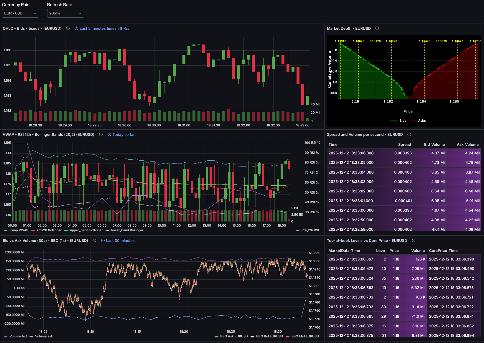
Here's how it works. You can see the result in our live FX order book dashboard (screenshot below, market depth chart in top right), which updates in real-time with actual EUR/USD, GBP/USD, and other major currency pairs.
Quick Context for Non-Finance Readers
A market depth chart shows how much buying and selling interest exists at each price level in an order book. Large "walls" of orders act as support and resistance, traders watch these to understand liquidity and predict where prices might stall. Think of it as a histogram of supply and demand, but cumulative and updating in real-time. See my previous post for a detailed explanation.
The Visualization Challenge
A market depth chart is a stepped area chart showing cumulative volume at each price level. The bid side (green) typically appears on the left with prices decreasing, and the ask side (red) appears on the right with prices increasing. The gap in the middle represents the bid-ask spread.
Several challenges make this tricky to render:
- Scale variance: Volumes can vary by orders of magnitude (from thousands to millions), requiring logarithmic scaling
- Stepped rendering: Unlike smooth line charts, depth charts need "stair-step" rendering where each price level creates a horizontal plateau
- Fill areas: The area under each curve needs to be filled to emphasize cumulative depth
- Order walls: Large orders at specific price levels are important (they act as support/resistance and signal market maker positioning), but showing every single order creates visual noise
- Real-time updates: Market depth changes continuously, so the chart needs to handle frequent data updates efficiently
Grafana's built-in Time series panel can't handle the stepped fill areas properly. The Bar chart can't show cumulative relationships. The Histogram doesn't work with this data structure. Something more flexible is needed.
Why Plotly?
Plotly is a JavaScript graphing library that gives you control over chart rendering. The ae3e-plotly-panel plugin for Grafana lets you write custom JavaScript that receives query results and returns a Plotly chart configuration.
This works for market depth because:
- Full control: I can specify exactly how the data should be rendered
- Stepped lines: Plotly supports
shape: 'hv'line rendering for stair-step visualization - Fill areas: Built-in support for
fill: 'tozeroy'with customizable colors and opacity - Annotations: I can add vertical lines, labels, and other visual markers programmatically
- Performance: Plotly handles real-time updates efficiently, supporting the 250ms refresh rate
The trade-off is that you need to write JavaScript. But the code is straightforward and gives you exactly the chart you want.
Why Not Other Approaches?
I initially tried using Grafana's Time series panel with transformations, but it can't do stepped fills. The Histogram panel doesn't work with cumulative data. I looked at the Canvas panel (too low-level for this) and even considered writing a custom React panel plugin (overkill). Plotly struck the right balance: flexible enough for custom rendering, but high-level enough to avoid reinventing charting primitives.
Solving the Visual Clutter Problem: Segmented Wall Detection
In a real order book, you might have 50-100 price levels on each side, and many more when dealing with crypto-currencies. If you tried to mark all of these with vertical lines, your chart would become unreadable.
The solution I use is to divide each side of the book into equal segments, then highlight only the largest order in each segment. This gives you a representative sample of where the big "walls" are distributed across the price range, without cluttering the visualization.
Here's the algorithm:
function segmentedWalls(levels, nSegments) {const N = levels.length;if (N === 0) return [];const result = [];const segSize = Math.floor(N / nSegments);for (let seg = 0; seg < nSegments; seg++) {const start = seg * segSize;const end = seg === nSegments - 1 ? N : (seg + 1) * segSize;let maxIdx = -1, maxRaw = -Infinity;for (let i = start; i < end; i++) {if (levels[i]?.raw !== undefined && levels[i].raw > maxRaw) {maxRaw = levels[i].raw;maxIdx = i;}}if (maxIdx >= 0) result.push(levels[maxIdx]);}return result;}
The process:
- Divide the book: Split all price levels into
nSegmentsequal-sized groups - Find the max: Within each segment, find the level with the largest individual volume (not cumulative, we want the single largest order)
- Return the walls: Return only those maximum points, one per segment
With NUM_SEGMENTS = 4, you get exactly 4 significant walls highlighted on each
side. This is enough to show you where liquidity is concentrated without
creating visual noise.
The Complete Implementation
Let me walk you through the Plotly script, explaining each section and the reasoning behind it.
Parsing Grafana Data
When your query returns array columns (like I'm doing with array_cum_sum()),
different Grafana data source plugins may serialize that data differently. Some
return native JavaScript arrays, while others return PostgreSQL-style string
representations like {1.1650,1.1651,1.1652}. The first function handles both:
function parseArray(val) {if (Array.isArray(val)) return val;if (typeof val === "string") {return val.replace(/[{}]/g, "").split(",").filter(x => x.length > 0).map(Number);}return [];}
This defensive parsing ensures the script works regardless of which data source plugin you're using. When it gets a native array, it returns it as-is. When it gets a string, it strips curly braces, splits on commas, filters empty strings, and converts to numbers. This makes the code portable across different Grafana setups.
Extracting the Data
From the previous post, the query returns these fields:
bprices,bvolumes,bcumvolumes: Bid prices, individual volumes, and cumulative volumesaprices,avolumes,acumvolumes: Ask prices, individual volumes, and cumulative volumes
I extract these from Grafana's data structure:
const NUM_SEGMENTS = 4; // Controls how many wall segments per sideconst table = data.series[0];const fields = table.fields;const bprices = fields.find(f => f.name === "bprices");const bcumvolumes = fields.find(f => f.name === "bcumvolumes");const bvolumes = fields.find(f => f.name === "bvolumes");const aprices = fields.find(f => f.name === "aprices");const acumvolumes = fields.find(f => f.name === "acumvolumes");const avolumes = fields.find(f => f.name === "avolumes");if (!bprices || !bcumvolumes || !aprices || !acumvolumes) {throw new Error("Missing required array fields");}
Note that I'm extracting bvolumes and avolumes (the individual volumes at
each level, not cumulative) because I'll need them for the order wall
algorithm.
Preparing the Data Structures
I parse the arrays and create point objects that pair prices with their cumulative volumes:
const bps = parseArray(bprices.values.get(0));const bvs = parseArray(bcumvolumes.values.get(0));const brs = bvolumes ? parseArray(bvolumes.values.get(0)) : [];const aps = parseArray(aprices.values.get(0));const avs = parseArray(acumvolumes.values.get(0));const ars = avolumes ? parseArray(avolumes.values.get(0)) : [];const bids = [];for (let i = 0; i < Math.min(bps.length, bvs.length); i++) {bids.push({ x: bps[i], y: bvs[i], raw: brs[i] ?? null });}const asks = [];for (let i = 0; i < Math.min(aps.length, avs.length); i++) {asks.push({ x: aps[i], y: avs[i], raw: ars[i] ?? null });}
Each point has:
x: The price levely: The cumulative volume at that level (what we'll plot)raw: The individual volume at just that level (used for wall detection)
I sort the arrays to ensure proper rendering order:
bids.sort((a, b) => b.x - a.x); // Descending: highest bid firstasks.sort((a, b) => a.x - b.x); // Ascending: lowest ask first
Anchoring the Midpoint
To create a clean visual separation between bids and asks, I calculate the midpoint between the best bid and best ask, then anchor both curves there:
const bestBid = bids[0]?.x ?? 0;const bestAsk = asks[0]?.x ?? 0;const mid = (bestBid + bestAsk) / 2;if (bids.length > 0 && asks.length > 0) {const bidY = bids[0].y;const askY = asks[0].y;const midY = Math.min(bidY, askY);bids.unshift({ x: mid, y: midY });asks.unshift({ x: mid, y: midY });bids.push({ x: bids[bids.length - 1].x - 0.0001, y: 0 });asks.push({ x: asks[asks.length - 1].x + 0.0001, y: 0 });}
This does several things:
- Calculates the midpoint price (the spread center)
- Adds an anchor point at the midpoint for both curves, using the smaller of the two cumulative volumes
- Adds floor points (y=0) at the extremes to ensure the fill areas render correctly
The result is a clean gap at the spread with properly filled areas on each side.
Applying the Segmented Walls Algorithm
I apply the segmented walls function to both sides:
const topBids = segmentedWalls(bids, NUM_SEGMENTS);const topAsks = segmentedWalls(asks, NUM_SEGMENTS);
Then create the visual markers:
const wallLines = [...topBids, ...topAsks].map(wall => ({type: "line",x0: wall.x,x1: wall.x,y0: 0,y1: 1,xref: "x",yref: "paper",line: {color: "yellow",width: 1,dash: "dot"}}));const wallLabels = [...topBids, ...topAsks].map(wall => ({x: wall.x,y: 1.02,xref: "x",yref: "paper",text: wall.x.toFixed(5),showarrow: false,font: { color: "yellow", size: 10 }}));
These create dotted yellow vertical lines at each wall price, with the price
displayed as a label just above the chart. The yref: "paper" means the
y-coordinate is relative to the entire plot area (0 to 1), so the lines span
the full height regardless of data scale.
Building the Plotly Configuration
Now I assemble everything into a Plotly chart configuration:
const minX = Math.min(...bids.map(b => b.x), ...asks.map(a => a.x), mid);const maxX = Math.max(...bids.map(b => b.x), ...asks.map(a => a.x), mid);const pad = (maxX - minX) * 0.01; // 1% paddingreturn {data: [{name: "Bids",x: bids.map(pt => pt.x),y: bids.map(pt => pt.y),mode: "lines",fill: "tozeroy",fillcolor: "rgba(0,255,0,0.2)",line: { shape: "hv", color: "rgba(0,255,0,0.7)", width: 2 },type: "scatter",hovertemplate: "Price: %{x}<br>CumVol: %{y}<extra></extra>"},{name: "Asks",x: asks.map(pt => pt.x),y: asks.map(pt => pt.y),mode: "lines",fill: "tozeroy",fillcolor: "rgba(255,0,0,0.2)",line: { shape: "hv", color: "rgba(255,0,0,0.7)", width: 2 },type: "scatter",hovertemplate: "Price: %{x}<br>CumVol: %{y}<extra></extra>"}],layout: {plot_bgcolor: "black",paper_bgcolor: "black",font: { color: "white" },xaxis: {title: "Price",type: "linear",showgrid: true,gridcolor: "rgba(255,255,255,0.1)",zeroline: false,range: [minX - pad, maxX + pad]},yaxis: {title: "Cumulative Volume",type: "log",showgrid: true,gridcolor: "rgba(255,255,255,0.1)",zeroline: false},margin: { t: 20, l: 40, r: 10, b: 30 },shapes: [{type: "line",x0: mid,x1: mid,y0: 0,y1: 1,xref: "x",yref: "paper",line: {color: "white",width: 1,dash: "dot"}},...wallLines],annotations: wallLabels,legend: {orientation: "h",x: 0.5,xanchor: "center",y: -0.3}}};
Key configuration choices:
shape: "hv": Creates horizontal-then-vertical line segments, giving us the stepped appearancefill: "tozeroy": Fills from the line down to y=0, emphasizing cumulative depthtype: "log"on y-axis: Essential for order book data where volumes span orders of magnitude- Black background: Matches trading terminal aesthetics and provides high contrast
- Subtle gridlines:
rgba(255,255,255,0.1)gives just enough reference without distraction - Shapes array: Contains the midpoint line (white) and all wall lines (yellow)
- Annotations array: Labels for the wall prices
The hovertemplate provides clean tooltips showing price and cumulative volume
when you hover over the chart.
How To Use The Script
To implement this in your Grafana dashboard:
- Install the Plotly panel plugin in Grafana
- Connect to QuestDB via the PostgreSQL data source
- Use the market depth query from the previous post
- Paste the JavaScript from the repo into the Plotly panel's Script editor
Performance Considerations
TL;DR: 300-500μs queries, 250ms refresh rate, 4 updates/second, negligible CPU usage.
Here's the breakdown:
-
QuestDB query speed: The market depth query with
array_cum_sum()completes in ~300-500 microseconds on my setup. Even with network overhead, total query time is under 10ms. -
Plotly rendering: Modern JavaScript engines handle Plotly chart updates efficiently.
-
Data volume: I'm only transferring a few arrays per update. This is minimal bandwidth.
-
Grafana overhead: The Plotly panel plugin is lightweight and doesn't add significant processing overhead.
At 250ms refresh intervals, you can watch the order book "breathe" as market makers adjust their quotes in real-time.
What You're Actually Seeing
When you look at the completed chart, here's how to read it:
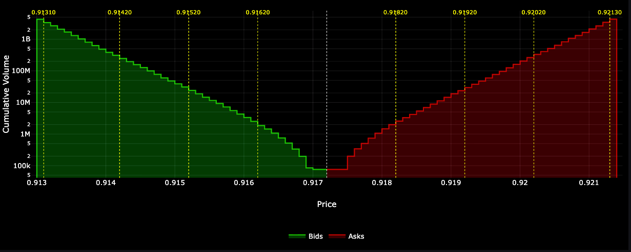
The bid side (green, left): Shows cumulative buy volume. As you move left (decreasing prices), the curve rises because you're accumulating more and more volume. The steeper the curve, the more liquidity is concentrated in that price range. A flat section means there's not much volume at those levels.
The ask side (red, right): Shows cumulative sell volume. As you move right (increasing prices), the curve rises for the same reason, you're accumulating sell orders. The symmetry (or asymmetry) between the two sides tells you about market balance.
The white dotted line (center): This is the midpoint between the best bid and best ask. It represents the current "fair value" or spread center. In liquid markets, this gap is tiny. In illiquid markets or during volatility, it can widen significantly.
The yellow dotted lines: These mark the order walls, the largest individual orders in each segment of the book. These are important levels to watch:
- Support/Resistance: Large bid walls can prevent price from falling (support), while large ask walls can prevent price from rising (resistance)
- Market maker positioning: These often represent market maker limit orders. If they disappear suddenly, it might signal a shift in market conditions
- Execution planning: If you need to execute a large order, these walls show you where you'll encounter significant liquidity
The logarithmic y-axis: Notice how the cumulative volume scale is logarithmic. This is necessary because volumes can range from thousands to millions. A linear scale would compress the lower levels into invisibility.
Wrapping Up
Market depth visualization has been missing from Grafana for years. By combining QuestDB's array capabilities with the Plotly panel plugin, I built market depth charts that work well for production use.
The key points from this implementation:
- QuestDB + Grafana + Plotly work well together: Fast array queries paired with flexible visualization gives you what you need
- The segmented walls algorithm is practical: It shows important liquidity without clutter
- Real-time is practical: Sub-10ms queries enable 250ms refresh rates
- JavaScript flexibility matters: Having control over rendering lets you build exactly the chart you need
The complete code is available in the QuestDB blog-examples repository.